Break-even Chart
A break-even chart is a graph which plots total sales and total cost curves of a company and shows that the firm’s breakeven point lies where these two curves intersect.
The break-even point is defined as the output/revenue level at which a company is neither making profit nor incurring loss. For a company to make zero profit, its total sales must equal its total costs. When sales are higher than total costs, it earns a profit but when total costs are higher than total sales, it loses money. A break-even chart visualizes the whole relationship and makes it easier to follow the break-even point.
A break-even chart is constructed such that units are plotted on the x-axis and revenue/cost on y-axis. It is useful only when the production is inside the relevant range i.e. output bracket in which fixed costs do not change.
Example
Let’s consider a cab company which charges $5 per kilometer. Its fixed costs are $200,000 per cab per annum and its variable operating costs are $3 per kilometer. Let’s find the minimum number of kilometers which the cabs must be plied or the company will suffer a loss.
Using the data above, we can write the following equations for total revenue and total costs:
$$ \text{TR}\ =\ \text{\$5}\ \times \text{Q}=\text{5Q} $$
$$ \text{TC} \\ = \text{FC} + \text{VC} \\ = \text{\$200,000} + \text{\$3}\times \text{Q} \\ =\text{\$200,000} + \text{3Q} $$
By plugging different Q values, we can create a table of total revenue and total costs, which may be bifurcated into total variable costs and total fixed costs.
An extract from the table is as follows:
| Quantity | Total Revenue | Total Cost | Total Variable Costs | Total Fixed Costs |
|---|---|---|---|---|
| 1 | 5 | 200,003 | 3 | 200,000 |
| 500 | 2,500 | 201,500 | 1,500 | 200,000 |
| 5,000 | 25,000 | 215,000 | 15,000 | 200,000 |
| 100,000 | 500,000 | 500,000 | 300,000 | 200,000 |
| 150,000 | 750,000 | 650,000 | 450,000 | 200,000 |
| 200,000 | 1,000,000 | 800,000 | 600,000 | 200,000 |
If we plot this table, we get the following graph:
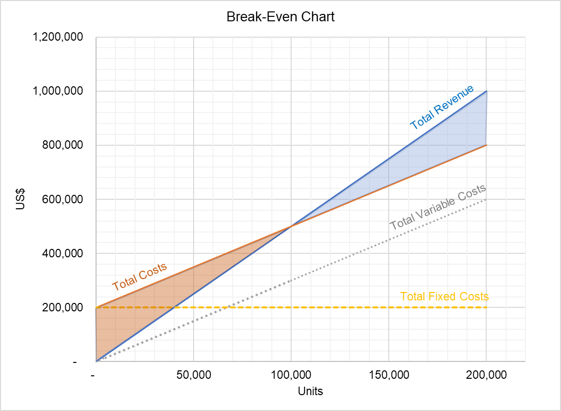
The break-even point is this example is 100,000 units because it is the output level at which the total revenue and total cost curves intersect.
At any point below the break-even point, the company is incurring losses equal to the red-shaded area and at any point above 100,000 units, the company is making profit as represented by the blue-shaded area.
by Obaidullah Jan, ACA, CFA and last modified on